The Motorola Moto Z & Moto Z Force (Droid Editions) Review
by Matt Humrick on July 28, 2016 8:00 AM ESTDesign
Motorola has used a common design language for its phones over the past few generations—rounded backs, minimal bezels, and the iconic circular dimple. Customization through Motorola’s Moto Maker website has also been a differentiating feature for its phones. Last year’s Moto X, for example, offers different color combinations for its aluminum frame, front bezel, and metal accent pieces. It also has swappable back covers that come in different colors and materials, allowing the phones to be highly personalized.
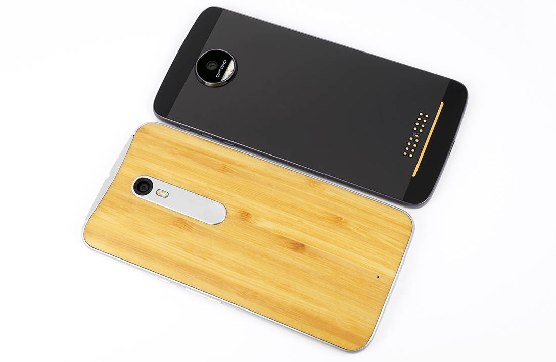
Out with the old, in with the new: Moto X Pure Edition (bottom) and Moto Z Droid (top)
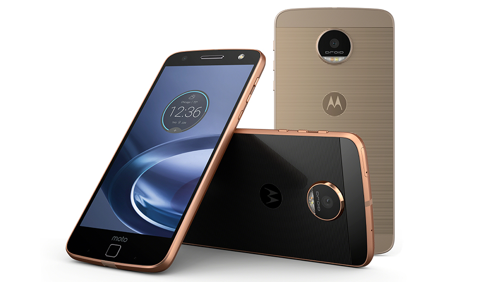
Motorola’s newest flagship phones still use an aluminum frame and allow some customization through Moto Maker, but are otherwise a radical departure from previous phones. The biggest changes are around back, but even the front of the Moto Zs show obvious differences. The lower bezel is now significantly larger than what’s found on the Moto X models; even the side bezels are a little thicker.
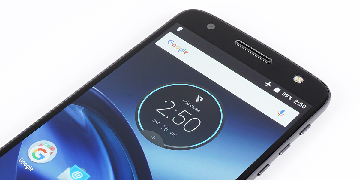
The square fingerprint sensor is primarily to blame for the bump in bezel size. I already mentioned how well it fulfills its primary function: Touching the sensor with an enrolled digit instantly wakes and unlocks the phone. It can also turn off the display and lock the phone by touching it with any finger, even if it has not been explicitly enrolled. Using the fingerprint sensor in this way is analogous to double-tapping the screen to wake or lock the phone and is more convenient than using the power button. Unlike most front-mounted fingerprint sensors, though, it does not function as a home button. Instead, the Moto Z Droids use onscreen navigation buttons. Sure, soft buttons hold some advantages, but they take up valuable screen space, and not using capacitive buttons here seems like a mistake when there’s so much extra room in the lower bezel.
On each side of the fingerprint sensor is a small microphone and an infrared motion sensor that activates Moto Display when you wave your hand over the phone. The circuitry for the display apparently sits behind the lower bezel, adding to its overall height and making room for a “moto” logo that’s reminiscent of past HTC designs.
A sufficiently large earpiece, which also does double duty as a mono front-facing speaker, is centered above the display. The ambient light and proximity sensors sit just to the right of the speaker. The 5MP front-facing camera sits in the upper-left corner, while an LED selfie-flash, a feature that’s still relatively unique, sits in the opposite corner. There is no additional motion sensor for Moto Display in the Z’s upper bezel like there is in the Moto X phones.
As similar as the two Moto Zs are, there a couple of minor design differences. First, the Moto Z Droid’s edge-to-edge cover glass has a slight bevel around the perimeter, giving edge swipes a smooth feel. The edge of the Moto Z Force Droid’s ShatterShield cover is not curved; it’s completely contained within the aluminum frame’s raised lip, instead. Second, the sides of the aluminum frame have a different shape. The thinner Droid has a smooth, tapered edge, whereas the Force Droid has dual tapers that meet in a raised ridge. This difference is more form than function, because it does not make the phone easier to hold or pickup.
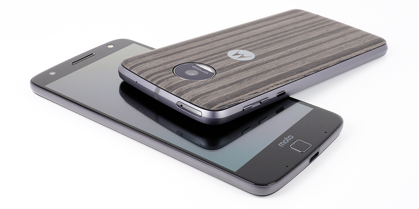
The top edge is home to another microphone (there’s a fourth one on the back) and the combination NanoSIM and microSD card tray, with a plastic antenna line in the middle. The only feature on the bottom edge is the USB Type-C port. Notably absent is a 3.5mm headphone jack, which means you’ll need to go wireless or use the included USB adapter cable—a part many will likely forget or lose. Call me old fashioned, but I like being able to plug in some headphones or external speakers and listen to music while charging the phone at the same time. I guess it’s inevitable, though, that Bluetooth or USB Type-C will replace the aging, analog headphone jack.
All of the buttons lie on the right edge towards the top, reducing the likelihood of pressing them accidentally when handling the phone. The individual volume buttons sit inside a scalloped slot, while the nicely textured power button is directly below. Because the Moto Z Droid is so thin, its buttons are actually smaller, giving them a sharper feel similar to the Galaxy S6 edge. The buttons fit snugly in the frame and make a solid click when pressed.
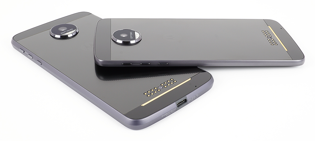
The back of the phones are designed to accommodate the Moto Mod accessories. Along the bottom of the completely flat back are a series of exposed gold pins that form the Moto Mod connector for sharing data and power with the modules. The circular camera housing sticks out pretty far, and is the only place we see any Verizon or Droid branding.
What's weird, though, is that the back is not just unfinished black plastic or metal. Motorola actually dresses it up with a lined pattern, Motorola logo, and color-matching plastic inserts at the top and bottom for the antennas. It's almost as if Motorola expects people to use these phones with nothing attached to the back. But with the exposed Moto Mod connector, a huge camera hump, and sides that do not blend nicely into the back, the phones just look … naked.
Fortunately, there's a series of decorative plates called Style Shells that snap onto the back to preserve the phones’ modesty. They also sit flush with the rear camera, and their curved surface blends better with the sides, making the phones much more comfortable to hold. The Style Shells start at $14.99 and come in several colors and materials that customize the look and feel of the new Droids, including real wood and fabric for $19.99 and real leather for $24.99. Both of our review units came with the Charcoal Ash wood shell.
The Moto Z Droids are not as customizable as the Moto X phones, however. The ability to mix and match pieces is gone, replaced by three color combination choices: Lunar Grey frame with black front and back (like our review units), Rose Gold frame with black front and back, and a Fine Gold frame with gold back and white front.

Moto Z Force Droid (left) and Moto Z Droid (right)
The most controversial of Motorola’s design changes—large camera hump, missing headphone jack, and smaller battery (at least for the Moto Z Droid)—are the result of making the new phones as thin as possible. The Moto Z Droid is only 5.19mm thick (excluding the camera hump), while the Moto Z Force Droid is a more common 6.99mm because of its larger battery. In this case, however, Motorola’s obsession with thinness extends beyond a bullet point on a marketing slide; it’s a necessary concession to enabling its vision for a modular smartphone.




75 Comments
View All Comments
osxandwindows - Thursday, July 28, 2016 - link
This was unexpected.I'm glad anandtech is speeding up with their reviews.
Ironchef3500 - Thursday, July 28, 2016 - link
+1Mugur - Thursday, July 28, 2016 - link
Well, they said that the 1060 review was to be expected last Friday... :-)ImSpartacus - Thursday, July 28, 2016 - link
Yeah, the best laid plans...powerarmour - Thursday, July 28, 2016 - link
With a bit of luck HL3 will be out soon also.ddriver - Thursday, July 28, 2016 - link
It wasn't due "last friday" it was due "next friday", you know, tomorrow never comes, because tomorrow it is always tomorrow.Eden-K121D - Thursday, July 28, 2016 - link
Exactlydhotay - Thursday, July 28, 2016 - link
Companies don't need to solicit Anandtech/Purch with payola for products that are flying off the shelves.ImSpartacus - Thursday, July 28, 2016 - link
Ouch. That's probably true. :(Dennis Travis - Thursday, July 28, 2016 - link
When Anand ran Anandtech the same accusations were thrown at him. Anandtech has never taken $$$ for a review. Yet people keep accusing them of doing so. Where is the proof?