The OnePlus 3T Review
by Brandon Chester on November 28, 2016 10:30 AM EST- Posted in
- Smartphones
- OnePlus
- OnePlus 3T
Software
OnePlus phones ship with OxygenOS, which is OnePlus's user interface and apps running on top of Android Marshmallow. Right now the OnePlus 3 runs OxygenOS 3.2.8, and the OnePlus 3T runs OxygenOS 3.5.1. Going forward, OnePlus plans to treat the devices the same as far as software support is concerned, so the versioning should remain consistent between the two once the OnePlus 3 gets updated with a stable build to match the 3T. Until then, there are some software differences that exist between the two phones.
OxygenOS has typically been one of the less intrusive Android skins out there. The OnePlus 3 is definitely not the same Android experience that you get on a Nexus phone, but it's not really that far off. Most applications have the same appearance, with small additions made here and there as required. OnePlus also makes tweaks to areas like the notification shade and the launcher by adding custom screens or buttons to add additional functionality on top of what is already provided by Android.
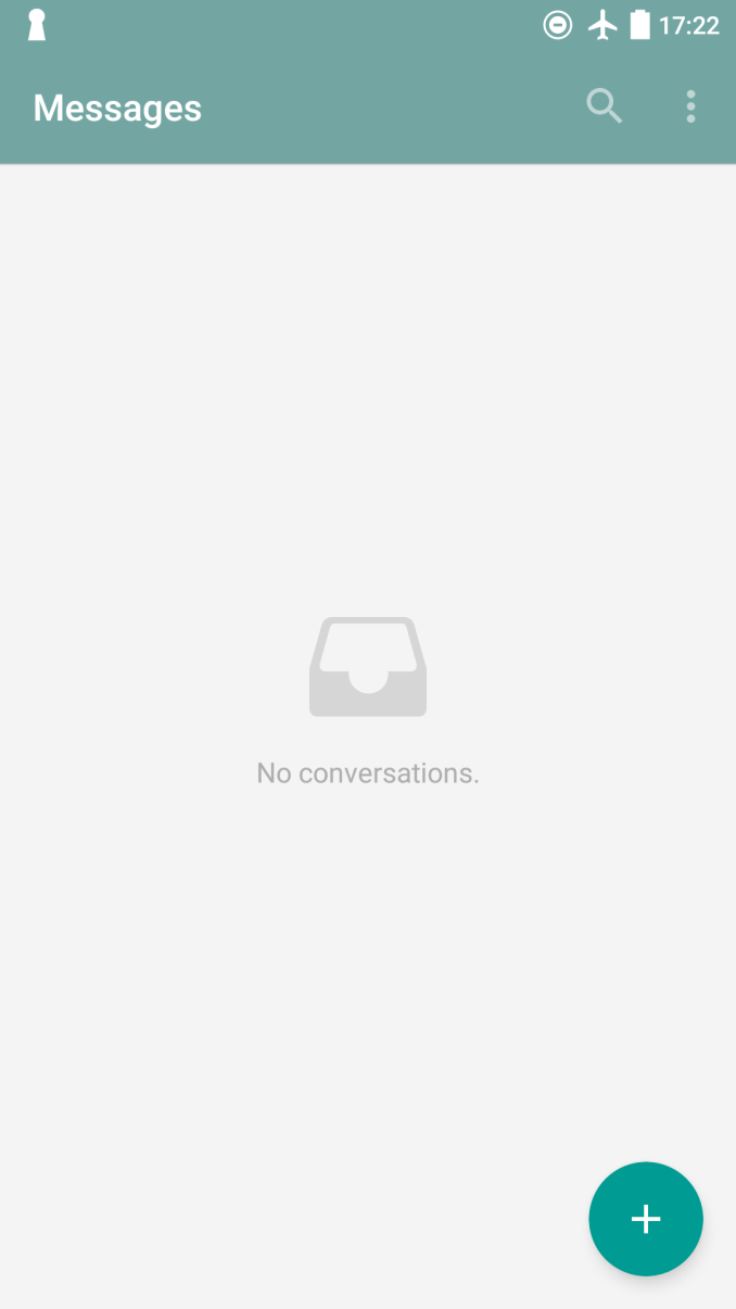
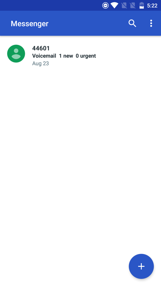
Left: OxygenOS 3.5.1. Right: OxygenOS 3.2.8
OxygenOS 3.5.1 is a bit heavier with its customizations than previous versions. Many of these changes are purely aesthetic. For example, the color scheme in many core Android apps has been changed, but the actual layout of each application remains unchanged. Calculator is now white and yellow instead of grey and cyan, Messenger has been renamed to Messages and has some layout and color tweaks, and settings has been styled in a different color while also receiving some tweaks to accommodate settings for custom OnePlus features. I honestly don't see anything wrong with these changes, but they do feel a bit arbitrary, as it's not like OnePlus is implementing a unified color scheme across all the apps that have been changed. It feels like differentiation for the sake of differentiation.
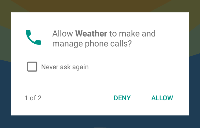
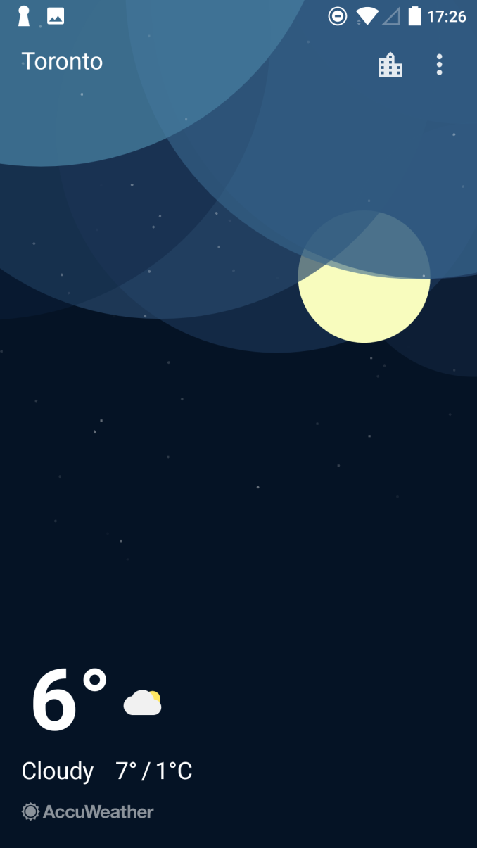
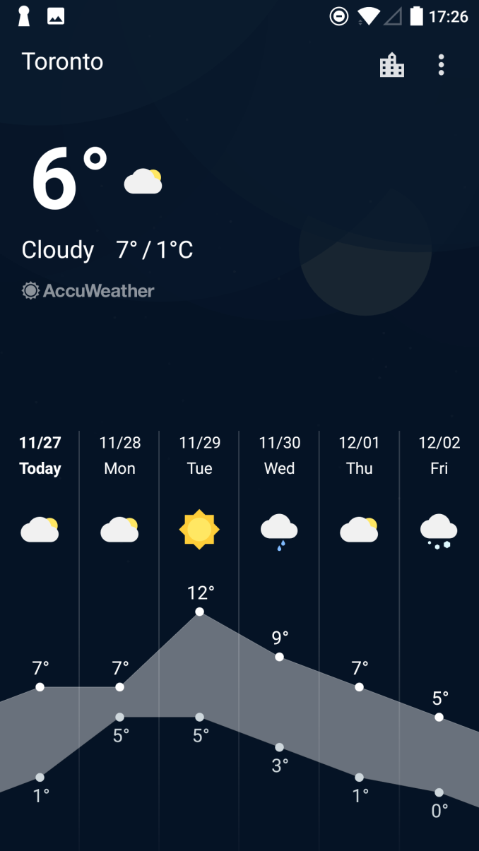
One of the notable additions in OxygenOS 3.5.1 is a new weather application. Unfortunately, this app is a prime example of how the new permissions system in Android can still fail miserably. To use the app, you need to give it permission to use your location, to use your phone to make calls, and to access external storage, which in this scenario means to access data outside the application's own data folder. If you deny any of these permissions the app simply closes, and if you tell it not to ask again it actually crashes on start. As far as Android application development goes, this is a terrible way to design an application. The app should always work to some extent if permissions aren't granted, even if the app's only purpose in that state is to display something saying that it can't work correctly because it needs permissions.
I find this to be quite a disappointment, because I actually like the new weather app. It has a simple design, with some cool interactive features like adjusting the weather effects in the UI based on the movement of the phone. However, I don't understand why it needs access to the phone or to external storage, and I don't want to give it my location because I would rather set my city in the app so I don't risk it constantly polling my current location and killing the battery. I hope that in a future update OnePlus can re-architect the app according to proper Android development practices so it can function to some extent regardless of what permissions are given.
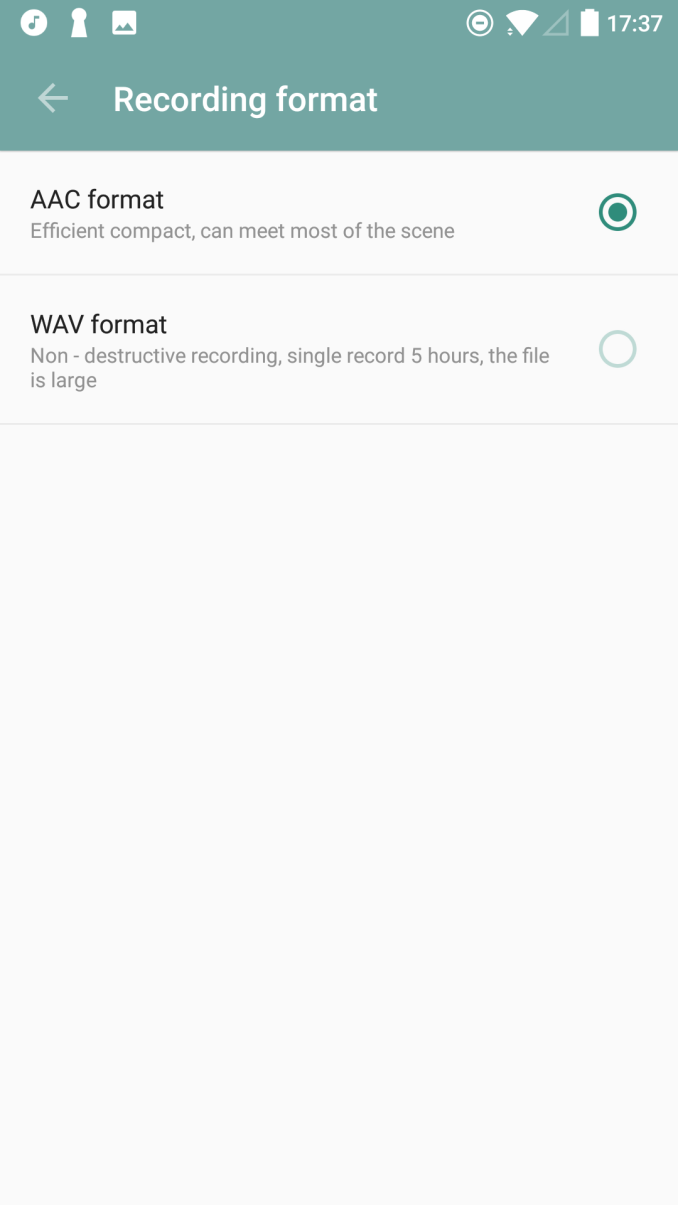
OxygenOS 3.5.1 also adds a voice recording app, which suffers from the same permissions issue as the weather app. Setting that aside, it's nice to see OnePlus filling in the gaps where Google and Android don't provide an app for a relatively basic feature that should exist. If I was making recommendations, I would ask for a video app in the next release, which is one of the other areas where Android still has no default solution.
One last thing I wanted to touch on is localization. Obviously when software is developed, it can be localized into different languages for different regions. In the case of devices from Chinese OEMs making their way to English-speaking countries, there can be areas where the translation of things can be questionable. Of course, this will often occur when translating between any two languages, but I can only speak to the cases where something is translated into English.
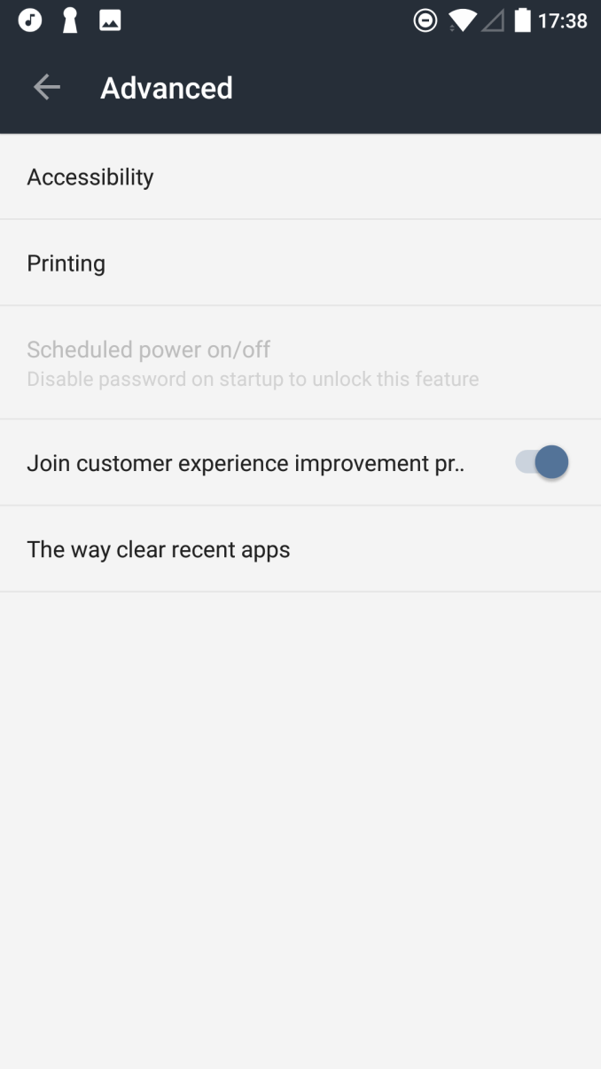
The reason I bring this up is because there are a few areas in OxygenOS where the verbiage used is pretty iffy, or a direct translation is put in without consideration of its length. For example, the recording application has descriptions of the AAC and WAV formats, and there are a number of oddities in the text. For the description of AAC recording I believe "can meet most of the scene" is meant to mean that the encoding is lossy but generally suitable quality, but I'm honestly not too sure. In the settings app there's a description for opting into telemetry, which is so long that it's actually truncated at the end. The label "The way clear recent apps" also has obvious grammatical issues, and it doesn't follow typical conventions for phrasing sub-menu names.
None of these mistakes present a usability issue in the OS, but they can make certain things confusing for users who don't have existing knowledge to help them figure out the intent of the text in a label or a description. I'm only bringing it up as something that OnePlus should keep an eye on going forward so the software improves. Improving the quality of localizations also helps in making the additions that OnePlus makes to the OS more consistent with the existing content provided by Google, which leads to a higher and more uniform level of quality.




104 Comments
View All Comments
igavus - Monday, November 28, 2016 - link
I hope that history will start putting buttons on the right side though, cause the left side is firmly inside the the wallet and thus inaccessible. One could make the wallet open up on the wrong side.. but, why?!negusp - Monday, November 28, 2016 - link
...left-handed people?greyhulk - Monday, November 28, 2016 - link
Wallet? Who the hell puts their phone in a wallet?MonkeyPaw - Monday, November 28, 2016 - link
I think the poster means those wallet cases. For people who want a bulkier phone, all while looking like they are talking into their wallets! I guess it might be more practical if one also wields a purse?jaspreet - Tuesday, November 29, 2016 - link
My office collegue got a pixel xl and has been showing off as to how good it is . I will be sending him this article which clearly shows that pixel xl is a much much poorer phone than a almost half priced One Plus 3T . Time to shut him up :)igavus - Tuesday, November 29, 2016 - link
Well, it's the least bulky option of carrying everything I need in one item. Separate wallet, card holder, phone, key chain - even more bulk. As for talking to my wallet, you get used to it :)Meteor2 - Tuesday, November 29, 2016 - link
I've had several different magstripe cards -- hotel key cards, shop loyalty cards, a credit card -- wiped, presumably by EM radiation from the phone, in wallet cases. Lesson learnt! I do use a wallet case though as they provide all-round protection without ruining the display with a screen protector.skeeter1234 - Thursday, December 1, 2016 - link
Wallet cases have magnetic strips to keep the case closed.....bad for credit cards or anything close by with a mag strip....leexgx - Wednesday, January 18, 2017 - link
not a problem in the EU/UK as we use chip and pin (my mag strip mite be working mite not be I don't know nor care), but damaging the screen protector or the screen it self I have seenhappen in these type of caseslazarpandar - Tuesday, November 29, 2016 - link
Lol what wallet are you talking about you spaz