NZXT H2: Not Quite Quiet
by Dustin Sklavos on May 26, 2011 2:43 AM EST- Posted in
- Cases/Cooling/PSUs
- mid-tower
- NZXT
In and Around the NZXT H2
I have to admit, I was fairly smitten with the NZXT H2 the first time I saw it at CES—though interestingly, NZXT wouldn't even let us take photos at the time. It doesn't seem to be that often that manufacturers try to engineer cases that are, frankly, this quiet. Antec has more or less cornered this market with the P183 and Sonata series, and those aren't cheap cases. With the H2, NZXT has sought to do what we hope every manufacturer would do: take cues from the competition and try to innovate. I'm liable to keep bringing up the P183 during this review, and there's a reason for that: I feel like the H2 is an inexpensive alternative to that case.
The comparison starts with the front door of the case, which has a lot of attractive, sharp angles to it and a single clear triangle at the top that the white indicator LED shines through. As far as lighting goes, that's really it, too. The white LED is bright but not overwhelmingly so; this is a very modest design. When you open the front door, you'll see the inside of it lined with noise-dampening foam. It hides two case fans and three 5.25" bays, and everything is hard plastic. The bay covers are extremely easy to remove by using the small sliders on the right side of each. Likewise, the two 120mm fans in the front can be removed by squeezing the tabs on the side and sliding them out. NZXT uses contacts on the fan housings and the case itself to power the fans, resulting in a clean and cable-less design. Behind the fans are the internal hard drive trays. All in all it's a very elegant solution.

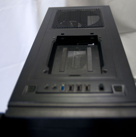
Where the H2 does diverge from the competition is the top control and I/O panel. These are becoming more and more popular lately and I absolutely welcome them; a lot of us keep our cases next to or under the desk, so having the ports and buttons on top just seems more logical. NZXT carefully but smartly packs the top of the case with a lot of useful features: a USB 3.0 port (routed from the back with a cable), three USB 2.0 ports, the usual mic and headphone jacks, a three-stage fan controller, and a hot-swap drive bay. The bay has a removable cover, though I would've been happier if the cover simply opened instead of coming off entirely. Behind it is the 140mm fan grille, which can be covered with a magnetic shield when not in use. Internally, NZXT also provides additional connections for more fans to use the integrated fan controller.

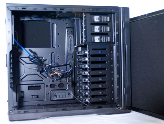
When you open up the H2 you'll find a relatively spacious design that seems geared largely towards ease of use and assembly. While I wound up running into more than a couple of quirks when actually installing the testbed into the case, this is generally a smart design that takes a lot of the better cues from the competition. The drive bays are all tool-less, and there are rows of thumbscrews mounted into the case itself to ensure you never have to go hunting for any new ones. There are really more thumbscrews than you should need, but it's such a welcome change of pace to even have a place for them that I wish more manufacturers followed NZXT's lead. Both side panels are also lined inside with noise dampening foam, and there's 25mm of clearance behind the motherboard tray for cable routing.
Everything else should be pretty familiar: the motherboard cutout for heatsink backplanes is becoming a standard in modern cases (you'd think Intel would take the hint that maybe the pushpins just aren't working out when the entire enclosure and heatsink industries are working around the issue), and the rubber-lined cable access holes are appreciated. Likewise, the expansion slots all have removable covers with grilles for ventilation, which is a welcome find in a case at this price range. All in all, the H2 is promising.


19 Comments
View All Comments
SquattingDog - Thursday, May 26, 2011 - link
I was quite looking forward to seeing how this case faired, as the H1 Hush was decent and quiet overall. The H1 Hush looks like it may have had more intake capabilities, with around half of the front 120mm fan exposed.Perhaps this case would be ideal for standard builds, but just not cut out for the job of a high-performance gaming machine, given it's comparatively low airflow characteristics.
I agree that the asthetics are decent for the price-level, and the dampening foam and internal build quality definitely has an appeal...what a pity NZXT didn't sort out the intake capabilities...
sometaken - Thursday, May 26, 2011 - link
I assume anandtech will be testing more cases in the future. I would like to see how the Fractal Design Define R3 stacks up against this NZXT offering and vs. the P183. It is very similar in design and sells at the same price point of the NZXT. However it looks to offer better cooling yet still provide silent operation.EnzoFX - Thursday, May 26, 2011 - link
SPCR has a great review on the Define R3.Regarding the review, a noise floor of 32db is too damn high. I'll take your noise assessment seriously when you get under 16db.
JarredWalton - Thursday, May 26, 2011 - link
Under 16dB? Really? That would require a serious investment in testing equipment and facilities, because you're not going to get to that level otherwise. I have a somewhat better SPL meter compared to Dustin, and when my house is completely silent I've gotten measurements as low as 28dB. Even the slightest noise at that level (e.g. a bird chirping outside, a passing car or plane, etc.) will increase the level to 30-32dB.Regardless, all of the cases are measuring above 34dB in our tests, so while that might be slightly higher than you could measure with a different test location and better equipment, the scores are relative to each other and show a clear difference. If Dustin gets a case that doesn't register above the noise floor, then there's more to complain about.
hechacker1 - Thursday, May 26, 2011 - link
As an owner of the Fractal Design R3, I can say overall it's a nice case, especially for hard drive and cable management.It's touted as a silent pc, and indeed, it is much quieter than my former Lian Li case it replaced. However, it's not silent in the truest sense, it's clearly audible over background noise.
But then I have a gaming rig in it, so I don't expect it be to silent, just quiet, which it does really well.
I would like Anandtech to tackle the R3, and perhaps their newer Arch series, which looks like an slightly fixed version.
The only thing the R3 lacks is USB3.0, and more space behind the mobo tray.
jrs77 - Thursday, May 26, 2011 - link
If you want to build a silent PC, then there's no better cases around then the Define-series from Fractal Designs. They changed the dampening-material from bitumen to something foamy that doesn't smell anymore a while ago and their internal layout is clean and efficient.Having only two 5.1/4" bays in the R3 and Mini is very welcome in that regard.
doctormonroe - Thursday, May 26, 2011 - link
Hopefully this site will test this power supply and release a review of it in the not too distant future.kasseren - Thursday, May 26, 2011 - link
To me it looks like you'd be better of buying the Fractal Design Define R3 or if you want silence and design more the new Cooler Master Silencio 550 that both seem to be in the same price range.jasonnovak - Thursday, May 26, 2011 - link
I have this case and really like it. The last page of the SPCR review shows how to widen the slot on the bottom of the door for more air intake, though they didn't retest it. I haven't had any overheating issues on mild overclock i5-2500k but I think I may break out the dremel and give it a tryAffectionate-Bed-980 - Thursday, May 26, 2011 - link
If you're going to review a case every 2 years, then how do you compare data?How about comparing this to a P182 or P183 or a R3?