HP Folio 13 Review: Deviating From the Norm
by Dustin Sklavos on April 17, 2012 12:30 AM EST- Posted in
- Laptops
- Intel
- HP
- Sandy Bridge
- Ultrabook
In and Around the HP Folio 13
After reviewing nothing but wedge-shaped ultrabooks, the HP Folio 13 is actually a bit of a breath of fresh air. HP's design here doesn't actually deviate all that much from the rest of their notebook lineup; aesthetically it sits right between their consumer and enterprise lines (much as it's intended to), and as I mentioned before they eschewed the wedge shape and kept the build right at the 18mm cusp of Intel's ultrabook spec.
The top lid and interior surface of the Folio 13 are aluminum, while the screen bezel and bottom of the notebook appear to be either carbon fiber or a rubberized treatment on matte plastic; either way, it's soft, light, durable, and attractive. In fact the only gloss on the Folio 13 is surrounding the keyboard and on the screen's interior bezel (which houses the webcam.)
.jpg)
Where HP can claim a major victory with the Folio 13 is the keyboard proper. Ultrabook keyboards, by virtue of the form factor, tend to be very shallow and can be difficult to use. Since HP's engineers seem to have gone in reverse and tried to see how big they could get the Folio while keeping it thin, light, and within spec, the result is a keyboard that has much better depth and travel. It's still not perfect and feels a little on the mushy side, but compared to the others I've tested it's much more comfortable. And as a special bonus: it's backlit.
Unfortunately, despite having an excellent keyboard for an ultrabook, the Folio 13's touchpad is another poorly implemented clickpad. As we've mentioned before and as Anand has even said to me personally, PC vendors still can't seem to get this part of the design down. Honestly I'm at a loss as to why they keep trying, as I have yet to use one that provides a tangible benefit over just using a traditional touchpad and pair of mouse buttons. At this point the only vendor with dedicated mouse buttons on their ultrabook is Toshiba. During testing I found the clickpad had such a hard time detecting misclicks that I was largely forced to use an external mouse.
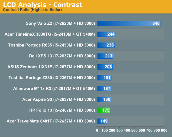
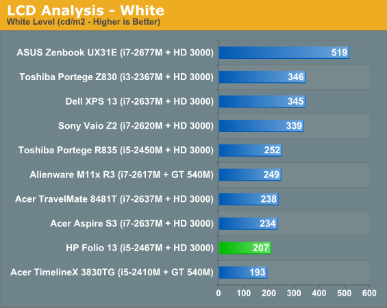
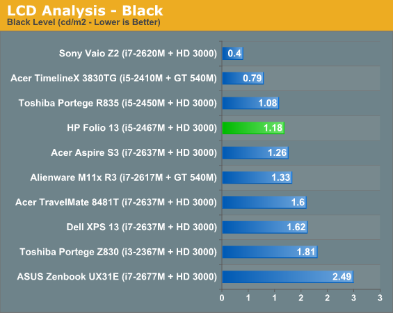
Finally, the screen on the Folio 13 is another poor-quality 768p TN panel. It's not really worth going through the full rigamarole for something that bothers all of us; suffice to say it's "competitive" with the majority of what's out there in this class, though hopefully the days of dismal notebook screens are drawing to a close as tablet screens push things forward.


The remainder of the results are available in Bench, but you can tell the Folio 13's screen isn't very good even by ultrabook standards. The best in an otherwise bad bunch are the ASUS Zenbook UX31E, which at least sports at 1600x900 resolution, and the vastly more expensive Sony Vaio Z2, which runs at full 1080p but costs nearly twice what some of the other ultraportables do.


_thumb.jpg)
_thumb.jpg)
_thumb.jpg)
_thumb.jpg)
_thumb.jpg)
_thumb.jpg)


88 Comments
View All Comments
RaistlinZ - Tuesday, April 17, 2012 - link
I think they could have done a lot better. They must be making massive profit off each unit sold because I don't see anything spec wise that warrants a $1,000 for this. Toss in another 4GB of 1600DDR3 and a 1080p IPS screen and THEN we'll talk about $1,000.milkywayer - Tuesday, April 17, 2012 - link
It's a shame that HP and DELL are still milking the market with these lowly 768p screens on majority of their machines. I'd let this one pass since its a 13 incher but why on earth are they still making 99% of their 15.6" laptoptops 768p is beyond me.My main laptop is an HP with a c2d 15.6" and I am not upgrading untill i can get at least a 1080p screen on my next laptop (no, i can't afford an apple)
GUessing the ipad3 screen res bump will get things in motion for higher res consumer screens on laptops from HP and dell or better yet, i'd like that hp and dell vaporise like NOKIA's way if they dont want to innovate.
Meaker10 - Tuesday, April 17, 2012 - link
Would not be so terrible if they were user upgradable but they save 0.001p per machine by not including the second LVDS channel.ImSpartacus - Tuesday, April 17, 2012 - link
It will probably be a while before OEMs catch up. Apple will have to release its "Retina" MBPs before anything really starts to move forward.Cullinaire - Tuesday, April 17, 2012 - link
Preciselyfic2 - Tuesday, April 17, 2012 - link
I have to agree. My 6 year old c2d laptop has a 1280x800 screen. Why would I "upgrade" to a worse screen? The cpu is still fine for my everyday tasks and I have upgraded the 60G HD and memory that came with it.Every review I skip down to the screen resolution and when I see 768 I quite reading and skip to the comments to b1tch about it.
fic2 - Tuesday, April 17, 2012 - link
Also, I spent ~$600 for my laptop why anyone would spend $1000 on this I have no idea.GuinnessKMF - Tuesday, April 17, 2012 - link
First thing I did too, saw 768 and said "not interested". 1080p minimum at 13" for me to bite, until then I'll wait. I would even prefer better than 1080p but I know that for most consumers, even most power consumers, that's enough.slagar - Tuesday, April 17, 2012 - link
Exactly!Drewdog343 - Thursday, April 19, 2012 - link
You geeks must have the vision of a hawk, 1080p on a 13" screen is 168ish DPI.I would imagine in Windows everything would be pretty tiny.