Toshiba Satellite U845: Ultrabooks Go Mainstream
by Vivek Gowri on October 8, 2012 5:00 PM EST- Posted in
- Laptops
- Intel
- Toshiba
- Ivy Bridge
- Ultrabook
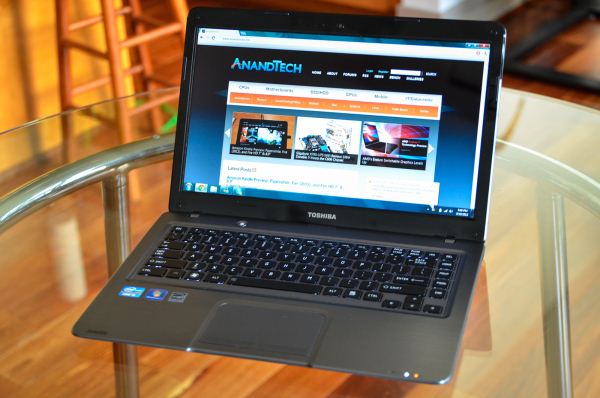
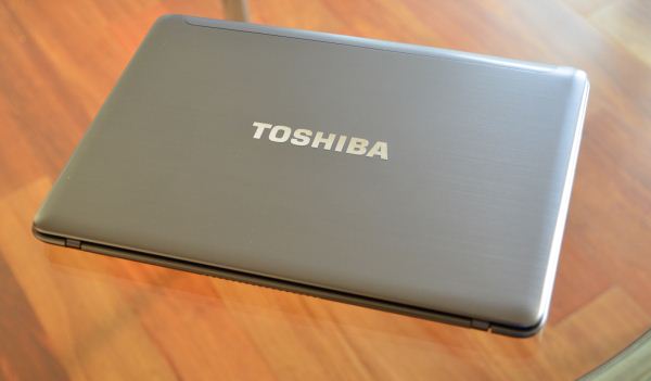
From a design standpoint, the U845 is pretty decent, and much better than I’m used to seeing from Toshiba. The chassis is made of exactly two pieces, just a top half and a bottom half, similar to the unibody style of notebook design. Unlike the traditional unibody, which has a wraparound top half and a bottom piece that mounts up to it (think of the panel on MacBook Pros that covers the entirety of the underside), the U845 has a panel on top that drops onto the wraparound bottom half. The bottom half is plastic, while the top panel is brushed aluminum, a treatment similar to what HP has done for their Envy Sleekbook/Ultrabook chassis (which also has the bottom unibody and top panel construction).
I suspect that it’s simply cheaper to have a plastic bottom unibody with a metal panel on top, because you still get the metal look and feel on the palmrests without having to actually carve the majority of the chassis out of a single block of metal. Having a simple aluminum plate means less material and less machining, which means way less cost. Once you start having to mill out openings for ports, I can completely understand how you would make a financially motivated decision to go with an injection molded plastic part, where creating the tooling is the major expense and things like material cost and machining are comparatively very minor.
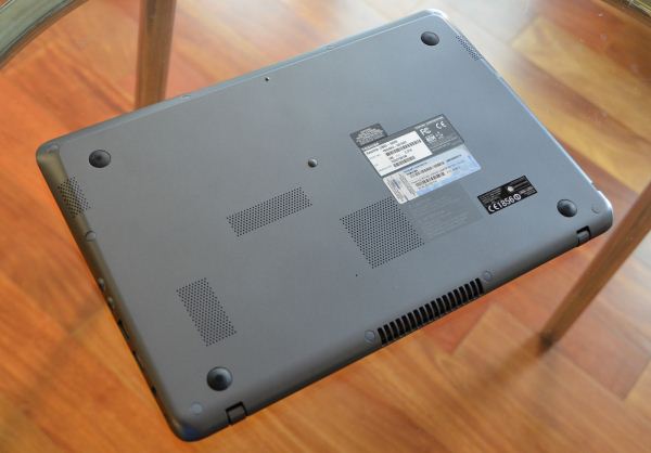
The bottom is completely free of easy upgrade access ports, so I suspect that attempting to upgrade this system will be a pain—making the initial upgrade to 6GB memory probably worth it in the long run (though it would be nice to see an 8GB option as well). That’s actually the big downside in unibody designs, particularly ones with wraparound bottoms: you have to take two-thirds of the chassis off just to get access to basic memory and storage components. I thought the way Apple handled this with their unibody MacBook Pros was great, at least until they started making everything non-upgradable.
My chief complaint with the industrial design? The LCD bezel. It’s ridiculous; why companies feel the need to put a glossy black bezel around an already glossy display is something I continually find myself asking. It’s distracting, and it goes a long way towards cheapening the look.
The U845 aesthetic is mostly clean and inoffensive (notable exception: LCD bezel), but it doesn’t have the same premium look as many of the 13” Ultrabooks out there. Which is basically what I expected, but what really surprised me about this design was the build quality. It feels solid and well put together, which is unexpected because, let’s face it, this is a midrange Toshiba. No offense, but over the last half decade or so, the Satellite line hasn’t done a whole lot to inspire respect or confidence. The higher end Portege models have been decent, but the Satellites are a different story—they're generally mediocre systems that tend to be designed and built to standards lower than expected. The U845 is different, and that’s a very good thing.
The unibody construction has done wonders here, helping the entire notebook feel sturdier by having less parts to deal with, and the aluminum upper casing has done the job by keeping the palmrest and interior stable and flex-free. Overall, the system feels reassuringly weighty, and to be honest, I think it’s built better than the Samsung Series 5 Ultra. That’s an important step forward for Toshiba, being able to tout build quality in their midrange notebook products. I’m a fan.
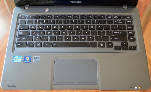
The input device combination is a bit of a mixed bag, with a multitouch trackpad with Synaptics drivers and their standard suite of gesture support. The click is a bit firm for my tastes, but the pad itself is responsive and has good sensitivity. The keyboard is somewhat unfortunate—it looks and feels just like the keyboard from the R700, none of which is good. It’s stable enough in normal use, but it exhibits flex under pressure. The biggest issue is that the typing feel is pretty mushy. You get used to the absence of adequate feedback, but the lack of positive keypresses is still an issue for Toshiba, and the lack of improvement in that area over the last three years is rather disappointing. But other than the keyboard and LCD bezel, the hardware is surprisingly robust, a definite positive for Toshiba.


57 Comments
View All Comments
quiksilvr - Monday, October 8, 2012 - link
*facepalm*W--WHY?! Why, why, why, why, why. That is a deal breaker to the nth degree for me. I hate lugging a USB HD webcam because of subpar cameras. Why can't I find a decent Ultrabook with a good HD Webcam that doesn't cost an arm and a leg?
retrospooty - Monday, October 8, 2012 - link
forget that, It lost me at 1366x768. WTF!!! its Q4 2012 and its still 768 lines? Never. Not in anything larger than 10 inches.Samus - Monday, October 8, 2012 - link
Lost you at 1366x768? Lost me at Toshib....HP Folio 13 can be had for under $600 on eBay and it comes with a 128GB SSD. So I don't see any appeal, at all, to this thing. The keyboard is crap, the screen is crap, it has a hard drive (personally, I don't think any laptop that will be moved around at all during its lifespan should have a mechanical drive in it...) and it's pretty heavy to be considered an Ultrabook.
Belard - Tuesday, October 9, 2012 - link
What part of "mainstream / low cost Ultrabook" did you and others did NOT understand? Want something better, pay the price. Most of the top 10 pc notebooks that sell are under $500. While the bottom end MacBook air starts at $1000.Hence Ultrabook sales are low. Because for most people, a $400~600 notebook will get the job done.
Samus - Tuesday, October 9, 2012 - link
Maybe you didn't understand. I just said you could get a high end ultrabook for the same price (or less) than this "mainstream / low cost Ultrabook"I'm not saying you can get a Thinkpad X1 for $600, but the Folio 13 and a number of Asus notebooks can be had for the same price as the U845, so I'm wondering why they are not being reviewed and THIS is.
Dustin Sklavos - Tuesday, October 9, 2012 - link
Do you just not read the site?We've reviewed a view ASUS ultrabooks AND the Folio 13.
Dustin Sklavos - Tuesday, October 9, 2012 - link
*few.nbgambler - Wednesday, October 10, 2012 - link
One of the few times in life I wish there was a '+1' button! LMAOquitesufficient - Monday, October 8, 2012 - link
For putting 1366x768 on the first page so I can easily scroll down and stop reading the review immediately before wasting my time.r3loaded - Monday, October 8, 2012 - link
I did exactly the same - Ctrl+F, typed in 1366, got a match, jumped straight to the comments section. Reading the rest of the review is pointless if a company can't get the basics right.