Hands On With Samsung's Galaxy S8 and S8+: Taller Screens and Slimmer Bezels
by Matt Humrick on March 29, 2017 11:00 AM EST- Posted in
- Smartphones
- Samsung
- Galaxy
- Mobile
- Galaxy S8
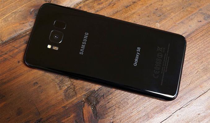
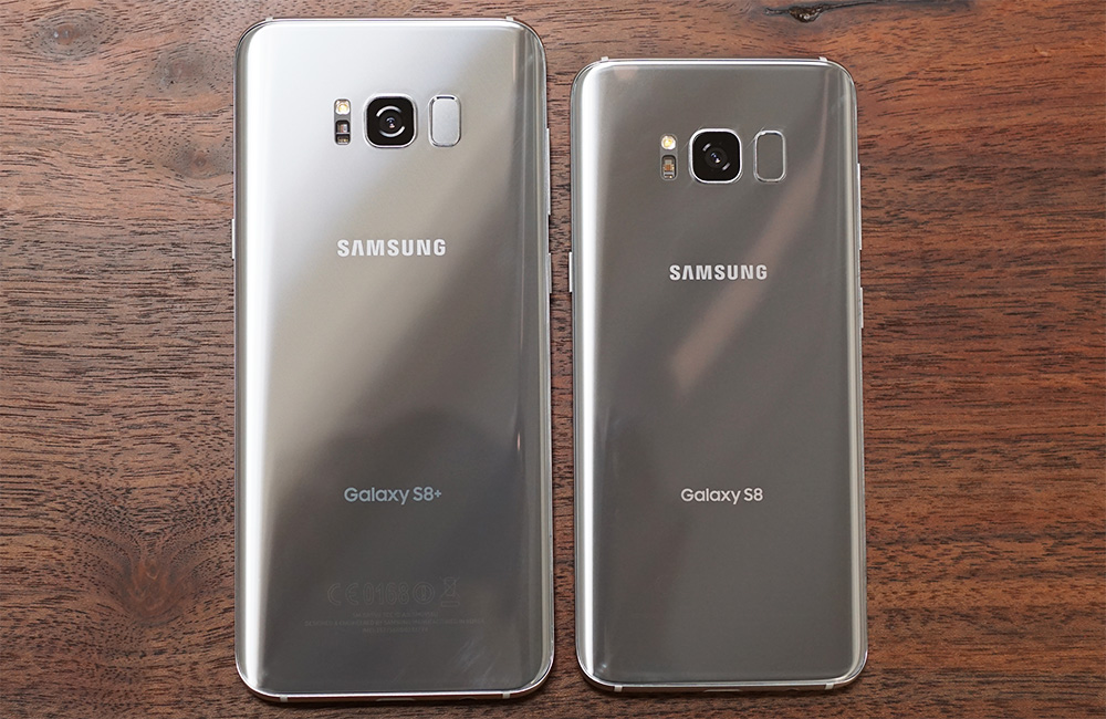
Samsung officially unveiled the latest Galaxy devices at its Unpacked event in New York today. Previous Galaxy phones were part Porsche 911 Carrera, with an easily recognizable curvaceous style, and part Swiss Army knife, bristling with technology and features. This analogy holds true for the 5.8-inch Galaxy S8 and 6.2-inch Galaxy S8+, which share the same design DNA as the previous two generations.
The new phones’ aluminum frame remains sandwiched between edge-to-edge Corning Gorilla Glass 5, with curved sides on the front and back. The curved rear glass makes the phones easier to pick up and more comfortable to hold just as they did for the S7 and S7 edge, while the curved front glass—now standard on both S8 models—adds some visual flair.
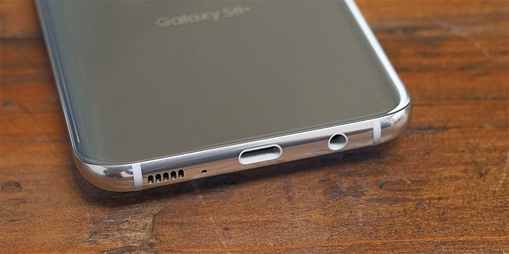
There’s not much difference between the S8 and S7 along the sides either. The USB Type-C port on the bottom is flanked by a 3.5mm headphone jack and a single downward-firing speaker. The microSD/NanoSIM combo tray still resides on the top, and the thin power button is still a bit more than halfway up the right side. The only differences between new and old lie on the left side, where the volume buttons have been combined into a single rocker and a dedicated button for launching Samsung’s Bixby assistant makes its debut. Unlike the power button, I found myself occasionally pressing the Bixby button accidentally when picking up the smaller S8.
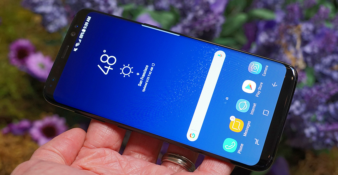
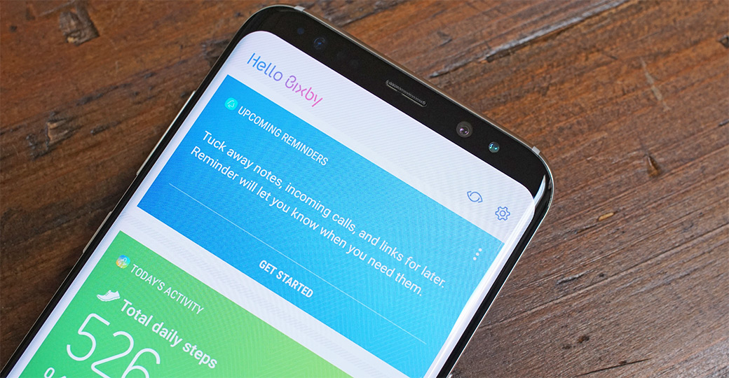
The most significant change is found up front, however, and it’s one that impacts both form and function. The Galaxy S8 and S8+ adopt Samsung’s new “Infinity Display” that stretches the screen vertically but not horizontally, deviating from the traditional 16:9 aspect ratio. The result is a QHD+ SAMOLED display with a 2960x1440 resolution and an 18.5:9 aspect ratio that’s very similar to the 18:9 aspect ratio display LG is using in its G6. Both Samsung and LG cite market research for this new display direction: People want larger screens that can show more content, but they also want phones that are useable with one hand and can fit in their pocket. The taller screen fits more content, so less scrolling, but keeps the phone narrow, so it’s easier to wrap your hand around.
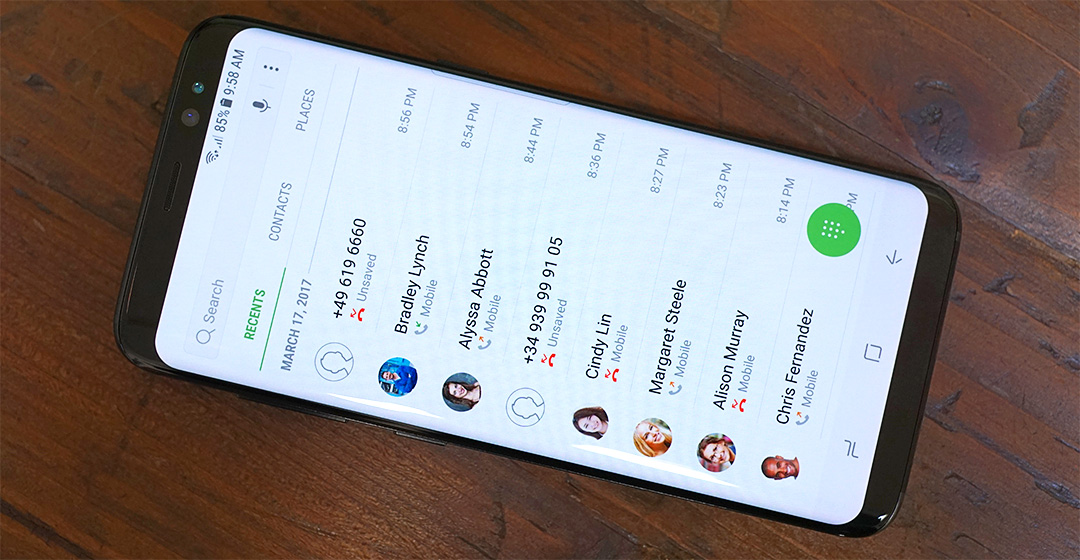
Both S8 phones incorporate another emerging design trend: rounded display corners. Where LG’s G6 is using an LCD panel that actually has rounded corners, it appears Samsung is using a rounded bezel to cover the S8’s still sharp-cornered display. This avoids the aliasing that’s evident in the G6’s corners, producing a much smoother, nicer looking effect. While my time with the S8 was limited, it appears that TouchWiz and Samsung’s apps were redesigned to account for the rounded corners: Backgrounds extend the full height of the display and visual elements are still displayed along the top and bottom edges without getting cut off. Third-party apps, however, find their vertical dimensions constrained to the purely rectangular portion of the display, with the status bar above and the navigation bar below taking on black backgrounds.
The S8 and S8+ are also the first phones to receive the UHD Alliance’s Mobile HDR Premium certification that ensures a mobile device meets the minimum requirements for playback of 4K HDR video. This means that both S8s are capable of rendering at least 90% of the DCI-P3 color gamut, have a dynamic range of at least 0.0005-540 nits, and support a 10-bit display pipeline.
To keep the overall size of the phones in check, the S8/S8+ and G6 have dramatically reduced the bezel area around the taller screens. Samsung claims a screen-to-body ratio of 83% for its new Galaxy phones, less than the 91.3% of Xiaomi’s Mi MIX concept phone, but impressive nonetheless, especially considering how much hardware is located in the S8’s upper bezel. Besides the usual earpiece and proximity/ambient light sensors, there’s a new 8MP front-facing camera with f/1.7 lens and Smart AF that uses facial recognition for accurate focusing when taking selfies. There’s also an IR LED and IR camera for the iris-scanning security feature that made its debut on the ill-fated Galaxy Note7.
Shrinking the size of the lower bezel required relocating the fingerprint sensor to the back. Instead of placing it below the rear camera like we see on most other phones, Samsung places it next to the flush-mounted camera, which is less than ideal. Both the camera and the sensor are surrounded by a raised lip and are similar in size, making it difficult to locate the sensor by feel, and if your finger misses the sensor, you end up with a nice fingerprint on the camera lens. On the smaller S8, this issue may be mitigated with practice, but the problem is worse for the S8+. Being taller, it places the camera and sensor further from the lower edge, making it very difficult, if not impossible, to reach the sensor when holding the phone with a natural grip. Even with my larger-than-average hands, I struggled to reach the sensor without shifting my grip. I suspect people will turn to the iris scanner or the new face unlock feature, which uses the front camera for facial recognition after pressing the power button, to overcome the poor fingerprint sensor placement. The physical home button and capacitive navigation buttons, iconic Galaxy design features, have also been evicted in favor of the slimmer bezel, replaced by onscreen controls.






208 Comments
View All Comments
ddriver - Wednesday, March 29, 2017 - link
Hate the lack of symmetry at the back. The sensor should have been under the camera, the flash - on top of it.Cellar Door - Wednesday, March 29, 2017 - link
Do you also hate the lack of symmetry on your own face? Because it is not perfectly symmetrical.What a stupid comment..
ddriver - Wednesday, March 29, 2017 - link
Actually the flash array and text would be more than enough to break the perfect symmetry, while still presenting an aesthetic view.I did say "symmetry", and not "perfect symmetry". What would have been sensible for samsung to do would still have a degree of asymmetry in line with the kind we see in the physical characteristics of normal human beings.
Bug talking about stupid comments, judging by yours, "normal human beings" excludes you, likely abnormally asymmetrical, due to severe inbreeding, detrimental to both looks and intellect.
brutedawg - Wednesday, March 29, 2017 - link
#rektniva - Friday, March 31, 2017 - link
The lack of symmetry in the back isn't as big a problem as how ugly the physical button made the previous gen phones from the front. I don't use fingerprint sensor anyways, always have PIN code required as input, so no big deal to me.I'm intrigued by the desktop feature and what that might bring about in terms of functionality. Wasn't expecting that from Samsung.
Bottom line, the good: looks, display, waterproof
Bad: fingerprint sensor position is questionable, touchwiz (the terrible abomination that will bring your device to a crawl within a few weeks/months and pretty much guarantees lack of updates or severe delays)
I'll stay away due to touchwiz, but props to Samsung for the general design decisions. First Samsung phone that actually appeals to me since the Galaxy Nexus (mine still works!)
Ratman6161 - Monday, April 3, 2017 - link
If you don't like touchwiz you know you don't have to use it right? Install a third party launcher and disable and set it as the default (and go a step further and disable touchwiz if desired). This works fine with my Note 5 so I'm assuming it will with the S8 too. I happen to use Nova Launcher (though there are many alternatives) and use package disabler to disable touchwiz.So not buying the phone solely because you don't like touchwiz doesnt make a lot of sense to me. Personally, I'm not getting an S8 because I like my pen on my Note 5 and also because the performance on the Note 5 is more than adequate to my needs...so no need for a new phone to begin with.
hp79 - Tuesday, April 4, 2017 - link
Actually, TouchWiz is not just a skin deep. It's integrated everywhere in the OS. I hated that every time I raise the volume or turn off data or sync or whatever, I get warning message that I can't turn off without rooting it. Rooting it makes SamsungPay useless and device unstable or not energy efficient so it's not desirable anymore. I don't understand why they have to change some things just for the sakes of the change. If it weren't for that, I probably would have stuck with S7 Edge or any future Samsung phones. No more Samsung Galaxy phones for me though. Oh, and don't forget battery drain on Samsung phones. Probably due to bad software from Samsung.BurntMyBacon - Wednesday, April 5, 2017 - link
@Ratman6161niva mentions both performance and lack of (or severely delayed) updates as issues attributable to touchwiz. While your solution may help (touchwiz is more than just a launcher) with some of the performance issues, Samsung certainly isn't going to give you updates for a longer period or in a more timely fashion just because you disabled the touchwiz launcher.
marcolorenzo - Sunday, April 2, 2017 - link
Wow, talk about spin! When people say symmetry, they are implying perfect symmetry. Look up the word's definition before using it next time.sl0wcheetah - Wednesday, April 5, 2017 - link
I like you!