Microsoft BUILD: Windows 8, A Pre-Beta Preview
by Brian Klug & Ryan Smith on September 13, 2011 12:05 PM EST- Posted in
- BUILD
- Windows
- Microsoft
- Windows 8
- Trade Shows
We’re here in Anaheim, California at Microsoft’s BUILD conference. As has become tradition (or at least as much as possible), Microsoft has been holding major developer conferences for their new OSes roughly a year ahead of launch. In 2008 developers and the press got their first in-depth look at Windows 7 at Microsoft’s Professional Developers Conference (PDC), and here in 2011 BUILD is doing much the same for Windows 8.
As it stands Windows 8 is still in its infancy. The build in Microsoft’s demos is 1802, a pre-beta and not feature complete version of the OS. Microsoft needs to balance the need to show off Windows 8 to developers with a need to keep it under wraps until it’s done as to not spook end-users. The result of that is the situation at BUILD, where Microsoft is focusing on finished features while unfinished features are either not in the OS or are going unmentioned. For comparison, at PDC 2008 the Windows 7 interface was not done yet, and Microsoft was using the Windows Vista interface in its place.
Today the show kicks off in earnest with a keynote that begins at the same time as this article went live, followed by some mega-sessions for developers covering the biggest aspects of Windows 8. Yesterday was a pre-show day for press, with Microsoft spending most of the day running the press through a similar series of presentations, focused more on the end-user than developers.
At the conclusion of the press sessions we managed to get some hands on time with a tablet PC development platform running the same build of Windows 8. We haven’t had the chance to give the platform a full working over – not that it would be prudent in its pre-beta state – but we did want to give you a rundown of what Microsoft had to share with us and what we’ve seen so far. Microsoft’s tagline for BUILD is that “Windows 8 changes everything” and while Win8 is not a massive reworking of the Windows kernel, it is a major overhaul of nearly everything else. Certainly based on the pre-beta build on display, you will be using Windows 8 significantly differently from Windows 7.
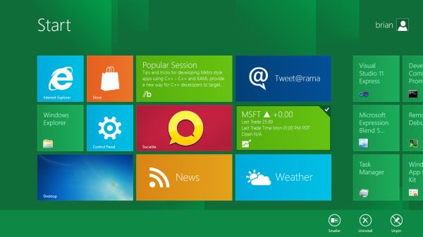
The big thing with Windows 8 is Metro, which we’ll go more in-depth with in a bit. Microsoft classifies Metro as a style, but in reality Metro is a new version of Windows from the API on up. Metro is the Windows Shell, Metro is an application design paradigm, Metro is a user paradigm, and Metro is the future of Windows application programming. Metro is everywhere – and for ARM it is everything - and it will make (or break) Windows 8.


235 Comments
View All Comments
martin5000 - Tuesday, September 13, 2011 - link
I'm try to like metro, but I can't. I just hate it.futurepastnow - Tuesday, September 13, 2011 - link
Sadly, I agree. I hate this. I look at the Metro tiles, and imagine them on my 24" non-touchscreen desktop display, and it makes me sick to imagine using my computer that way. People described the more colorful Windows XP theme as "Fisher Price" when it was new, but this really is like a computer for toddlers.I like almost everything I've read about Windows 8- the new file copy window, the technical improvements. But I want the desktop and only the desktop. If I can't disable Metro- and I mean 100% never-have-to-see-it disabled- then I'm not using this on a desktop or laptop PC. It makes sense on tablets. Nowhere else.
crispbp04 - Tuesday, September 13, 2011 - link
Live tiles are 1000x more useful than static windows 3.1 style icons. You're resisting progression. And as stated below it's just a shell. Microsoft always supports those who resist change, hence being able to upgrade from windows 1.0 through windows 7 and run the same 25 year old applications. You'll love and embrace windows 8.Ratman6161 - Tuesday, September 13, 2011 - link
If you multitask heavily (I currently have 13 different windows open) those tiles are going to spend the entire day hidden behind other windows aren't they? I don't even bother with background images on my system since I rarely see my desktop anyway.I think the task bar at the bottom of the screen showing all my open applications is far more useful than having to go back to the desktop for things.
In the past, Microsoft came under a lot of fire on mobile devices because people said they were trying to cram a desktop interface into a phone or PDA. Now they are making the same mistake in reverse - trying to make a desktop look like a phone.
I'm with futurepastnow - this will simply not work for me for the work that I do.
Alexvrb - Tuesday, September 13, 2011 - link
Then don't use it. Windows 8 still has Explorer. Turn Metro off.DeciusStrabo - Wednesday, September 14, 2011 - link
That's just it. You can't. It's starts Metro, and Metro in turn is your Start Menu and Launcher. Metro _is_ the Explorer. Literally. Metro resides in explorer.exe.I love the Metro UI. For mobile devices. For a desktop? It's more harm than use.
piiman - Wednesday, September 14, 2011 - link
According to MS you can turn it off.BenDTU - Thursday, September 15, 2011 - link
At least in the developer preview you can't. There's no option to do so. Metro is your start menu.Wraith404 - Thursday, September 15, 2011 - link
To Disable the wretched Metro failure, I mean feature:run regedit from the developer command prompt.
HKEY_CURRENT_USER\Software\Microsoft\Windows\CurrentVersion\Explorer
set the key RPEnabled to 0
LoneWolf15 - Thursday, September 15, 2011 - link
THANK YOU.(I never use all caps, but this time, emphasis was necessary)