How the Retina Display MacBook Pro Handles Scaling
by Anand Lal Shimpi on June 11, 2012 7:36 PM EST- Posted in
- Mac
- Apple
- MacBook Pro
- Laptops
- Notebooks
Earlier this morning Apple introduced its next-generation MacBook Pro equipped with a Retina Display. The 15.4-inch panel features a native resolution of 2880 x 1800, or exactly four times the standard 1440 x 900 resolution of a regular 15-inch MacBook Pro. As we've seen in the past however, an ultra high resolution screen in a small form factor can make for some very difficult to read text. The Retina MBP ships with a version of OS X Lion however that supports a number of scaling modes to take advantage of the ultra high res display.
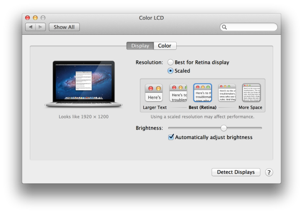
By default, the Retina MBP ships in a pixel doubled configuration. You get the effective desktop resolution of the standard 15-inch MacBook Pro's 1440 x 900 panel, but with four physical pixels driving every single pixel represented on the screen. This configuration is the best looking, but you don't actually get any more desktop space. Thankfully Apple exposes a handful of predefined scaling options if you do want additional desktop space:
Apple offers five scaled settings including the default pixel doubled option: 1024 x 640, 1280 x 800, 1440 x 900, 1680 x 1050 and 1920 x 1200. Selecting any of these options gives you the effective desktop resolution of the setting, but Apple actually renders the screen at a higher resolution and scales it to fit the 2880 x 1800 panel. As a result of the upscaled rendering, there can be a performance and quality impact. It's also worth noting there's no default option for 2880 x 1800, which is understandable given just how tiny text would be at that resolution. I suspect it won't be long before users figure out how to manually add a zero-scale, 2880 x 1800 option.
The gallery below shows the impact of these scaling options on desktop area as well as how much of the AnandTech front page you can see at each setting.


74 Comments
View All Comments
quiksilvr - Monday, June 11, 2012 - link
Why didn't they do 2560x1400 or 2560x1600? 2800x1800 is a 1.5:1 ratio, which increases black bars on the top and bottom of video clips, which means less screen real estate when video editing. It just doesn't make sense why they went this route at all.rscoot - Monday, June 11, 2012 - link
Huh? 2880x1800 is 16:10 just like every mbp has been for like 6 years or something.RamarC - Monday, June 11, 2012 - link
yup. i'm windows based and have always preferred 16x10 to 16x9. to me, 1680 x1050 is still the best balance between res and useabilty so I hope it resurrects that long lost "standard"eanazag - Tuesday, June 12, 2012 - link
I agree. My favorite 15.4" laptop was a Dell with 1680x1050.schenley101 - Monday, June 11, 2012 - link
its a 16:10 ratio. 2880x1800 not 2800x1800iwod - Tuesday, June 12, 2012 - link
I never knew the MBP remains a 16:10 Ratio! Why do they not used 16:10 on iMac as well?16:9 just doesn't make sense for Computer usage.
maratus - Tuesday, June 12, 2012 - link
It's probably because of increase in the number of 27" 2560x1440 panels with LED backlight, they're now more widespread than 30" 2560x1600, so that's probably on of the reasons. They should be slightly cheaper as well. I've no idea why no 1920x1200 for a smaller one, but there should be a similar reason.JasperJanssen - Tuesday, June 12, 2012 - link
The 16:10 panel in that size class (2560 wide) in IPS is a 30" which still costs (as a standalone display) roughly double what 27" 16:9 screens cost. The old Apple 30" Cinema Display was one of those.The other option is to go smaller, at 1920x1200 24". 27" 2560x1440 16:9 is apparently what apple considers to be the best price/performance mix.
radbmw - Monday, June 11, 2012 - link
It's 2880x1800 not 2800x1800. That's 16:10 which is standard, they doubled 1440x900 in each direction resulting in four times the pixels to make for an easy transition of existing apps.quiksilvr - Monday, June 11, 2012 - link
AHHHHH missed the 8 between the 8 and 0. Sorry for the pointless post.