Nexus 7 (2013) - Mini Review
by Brian Klug on July 27, 2013 12:54 AM EST- Posted in
- Tablets
- Snapdragon
- Qualcomm
- Android
- Mobile
- APQ8064
- Nexus 7
- Android 4.3
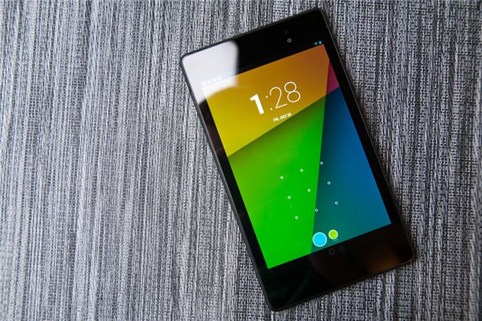
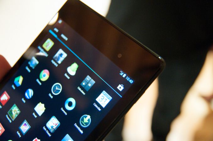
At an event in San Francisco, Google announced an updated version of the popular Nexus 7 tablet which first appeared at last year’s Google I/O. The big new features update the Nexus 7 platform with inclusion of a 1.5 GHz Snapdragon S4 Pro (APQ8064) SoC, 1920x1200 display by JDI (Japan Display Inc), as well as 5 MP rear facing camera, 1.2 MP front facing camera, stereo speakers, dual band WiFI, wireless charging (Qi) and a thinner and lighter chassis. It’s a major update that keeps the competitive price point that made the original Nexus 7 appealing (the lineup starts at $229 for the 16 GB model) while bringing numerous much-needed improvements that people have asked for.
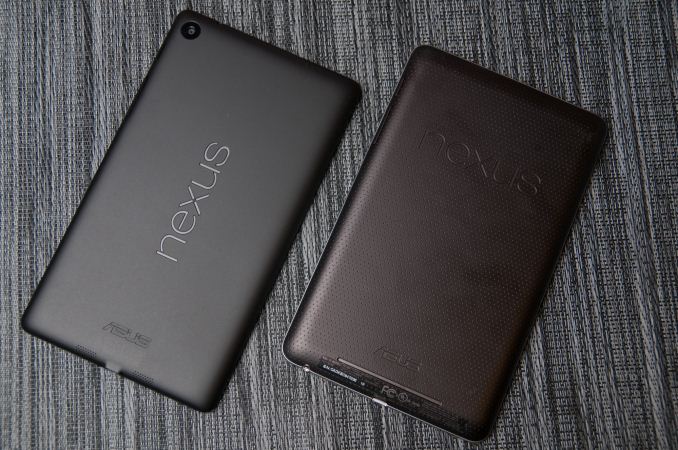
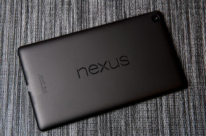
First off, it’s shocking how much of a difference the change in thickness and weight makes. The new Nexus 7 feels considerably lighter and thinner in the hand than its older counterpart. Gone is the textured rubberized (almost driver glove-like) material on the back, in its place a flat, uniform soft touch material. There’s Nexus emblazoned in landscape on the rear, which is a bit puzzling next to the 90 degree rotated ASUS down below. It irritates my OCD sensibilities seeing the two logos inexplicably perpendicular and right next to each other, but I suppose Google thinks this helps emphasize how much the Nexus 7 and Android platform are really tablet-friendly now, with landscape view support throughout the core apps.
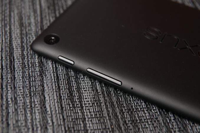
The rear facing camera is in the extreme top left, next to the power and volume rocker buttons, and top speaker. The Nexus 7 build and finish does feel a bit more plasticky to me this time around, but that’s almost expected given the price point, and it isn’t a major dig on the hardware at all. That’s not to say it isn’t sturdy or well put together, but just that the original Nexus 7 left a stronger impression on me last time, and I’ve been spoiled by the ASUS FonePad since then. The edge chamfer also helps the Nexus 7 feel a bit more like the Nexus 4 with its rounded edge. The previous Nexus 7 came to a point that could be a bit sharp at times.
What’s a little awkward is how tall the bezel at top and bottom looks on the Nexus 7, I’m warming up to it. On paper the new Nexus 7 is smaller in almost every dimension, in reality the elongated aspect ratio is definitely a bit pronounced here. There’s also still a notification LED well hidden under the glass at bottom in the center.
On the back is the new 5 MP rear facing camera, buttons (which hug the edges), a microphone port, and speakers. The speakers fire out the back of the Nexus 7 and look like they have good separation (obviously the best that the device’s size affords – top and bottom), but I don’t have a good feel for just how loud they go quite yet. Having stereo is a dramatic improvement for the audio part of video and multimedia consumption, and Android does 5.1 virtualization out the speakers as well. On the connectivity side of things there’s microUSB at the bottom with SlimPort video out, and a 3.5mm audio jack. I know a lot of people were hoping for inclusion of line in on the 3.5mm audio jack but I can confirm it isn’t present.
| Nexus 7Tablet Specification Comparison | ||||
| ASUS Nexus 7 (2012) | ASUS Nexus 7 (2013) | |||
| Dimensions | 198.5 x 120 x 10.45mm | 200 x 114 x 8.65mm | ||
| Chassis | Plastic + Rubber back | Plastic + Soft Touch back | ||
| Display | 7-inch 1280x800 IPS | 7.02-inch 1920x1200 IPS | ||
| Weight | 340 g | 290 grams (WiFi), 299 grams (LTE) | ||
| Processor | 1.3 GHz NVIDIA Tegra 3 (T30L - 4 x Cortex A9) | 1.5 GHz Qualcomm Snapdragon S4 Pro (APQ8064) | ||
| Memory | 1 GB | 2 GB DDR3L | ||
| Storage | 8 GB / 16 GB | 16 GB / 32 GB | ||
| Battery | 16 Whr | 15.01 Whr | ||
| WiFi/Connectivity | 802.11b/g/n, BT, NFC | 802.11a/b/g/n, BT 4.0, NFC | ||
| Camera | – |
5.0 MP Rear Facing w/AF 1.2MP Front Facing |
||
| Wireless Charging | – | Yes (Qi Compatible) | ||
| Pricing | $199/$249 |
$229/$269 (WiFi 16/32 GB) $349 (LTE) |
||
My only real complaint with the new Nexus 7’s in hand feel and build is with the power button and volume rocker, which feel somewhat mushy to me. I had issues taking screenshots even at times. It’s a minor gripe, but with only three buttons on the whole device, and generally good execution by ASUS with buttons on tablets, it surprised me. I guess I also do miss that racing glove-inspired texture in the soft touch on the back of the original Nexus 7.
| Nexus 7 (LTE) Band Coverage | |||||
| Model | GSM/EDGE Bands |
WCDMA Bands (HSPA+ 42) |
LTE Bands (UE Category 3) |
||
| North America Nexus 7 LTE |
Quad Band (850 / 900 / 1800 / 1900 MHz) |
HSPA+: 850/900/1900/2100/AWS(1700/2100) MHz (Bands: 1/2/4/5/8) | 700/750/850/1700/1900/2100 MHz (Bands: 1/2/4/5/13/17) | ||
| Europe Nexus 7 LTE | 800/850/1700/1800/1900/2100/2600 MHz (Bands: 1/2/3/4/5/7/20) | ||||
There’s a version of the Nexus 7 with 32 GB of storage and LTE onboard for $349 which will appear ‘in the coming weeks’ and includes support for AT&T, T-Mobile, and Verizon LTE in the USA on one piece of hardware. This is the first single SKU solution I’m aware of with coexistence of Bands 13 and 17 (Verizon and AT&T respectively) on the same device, which is awesome. There’s a model with Bands 3, 7, and 20 for Europe as well, so they’re not left out of the LTE fray. I had a chance to quickly get a look at the new Nexus 7 with LTE, which includes a microSIM tray and was working on one of the LTE networks in San Francisco just fine.
As far as I know, the Nexus 7 LTE solution is Qualcomm’s MDM9215 with a WTR1605L transceiver inside, and doesn’t necessarily include any of the new RF360 brand of front end hardware (like the power amplifier with integrated antenna switch or tunable front end), since MDM9x15 only works with QFE1320 (Bands 1,2,3/4,5,8,20). Still, that makes it all the more impressive, and Google deserves considerable kudos for further pushing such unprecedented interoperability, since in a tablet you do have more area to include discrete power amplifiers and filters.






252 Comments
View All Comments
ven - Saturday, July 27, 2013 - link
Screen position is off-centered, i don't know how it feels when it is in hands, but in the picture it is annoying to see that much space below the screen.old nexus 7 textured back finish was highly applauded, it's absence in the new one is slightly puzzling.mlj11 - Saturday, July 27, 2013 - link
What do you mean it's off-centre? Did you take into account the navigation bar with the 3 software buttons?Liquid_Static - Sunday, July 28, 2013 - link
I too am not sure what you mean...ven - Tuesday, July 30, 2013 - link
i didn't notice the software buttons at first.Tigeerguy - Saturday, July 27, 2013 - link
Excellent Article Brian as always. You fulfilled my wish so fast regarding the soc I asked on Twitter. It's great to see the new Nexus 7 is not using 200 as in Nexus 4. I was totally confused regarding the Snapdragon 600, which you explained in detail that this tablet comes with underclock one, glad it's clear now. I already have Nexus 7(2012) and wanted to update to the new model. Considering it will take sometime for Google to release the tablet in my country, I'll wait for September as Apple might release iPad mini that could change things if it comes with Retina display. Worth reading, and waiting for more in details by Anand. Thanks.Alpeshkh - Saturday, July 27, 2013 - link
Ditto.I usually don't comment here but had to comment after reading Brian's tweet regarding SoC!
I was bit disappointed after launch that they used S4 Pro and not S600. Not that it was a deal breaker but seeing One & S4 leapfrog N4 & Xperia Z's performance, I was almost sure Google would use S600 as it would be more future-proof and remember, new one has to power 1920*1200 display.
Read TheVerge's review and was disappointed that they didn't clarify about SoC. But seeing Brian's tweet that it basically is an under-clocked S600, made my decision to buy this one really easy.
Thanks Brian, appreciate the effort you & whole Anand Tech's team put in your reviews.
esterhasz - Saturday, July 27, 2013 - link
The Verge's review makes Brian's "mini review" read like an in-depth piece with academic aspirations. I'm really happy that a serious tech website does gadgets now.Impulses - Sunday, July 28, 2013 - link
Now? Anandtech's been doing the best smartphone/tablet reviews for like 2-3 years... Sometimes they lag behind (in time to publish) or don't cover every single permutation or model out there, but they've been at it even before the staff of The Verge left Engadget to form TIMN and eventually Verge.esterhasz - Sunday, July 28, 2013 - link
Yeah, true. Maybe it's just me who's been starting to read gadget reviews ,-)darkich - Sunday, July 28, 2013 - link
Check norebookcheck.net.Those are the best reviews out there imo